Applied Therapeutics

Industry | Healthcare

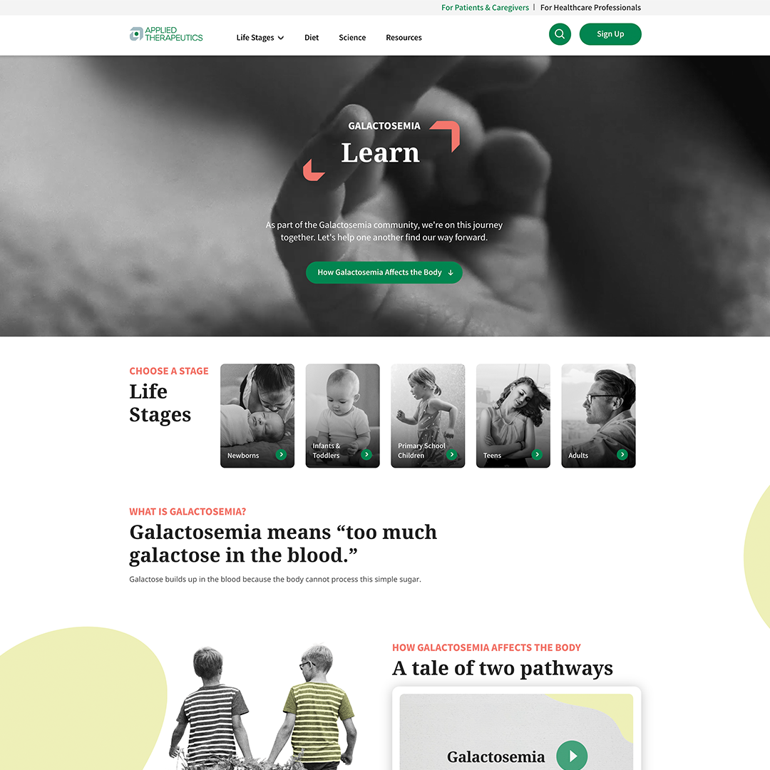
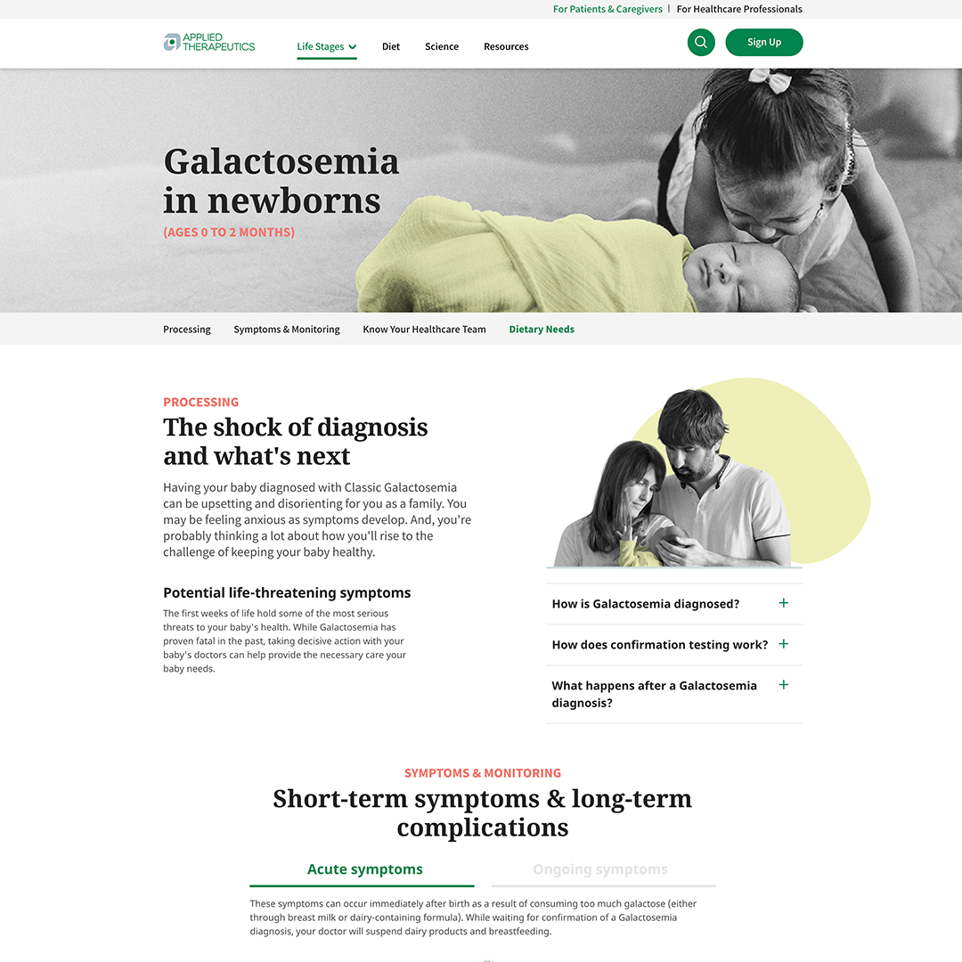
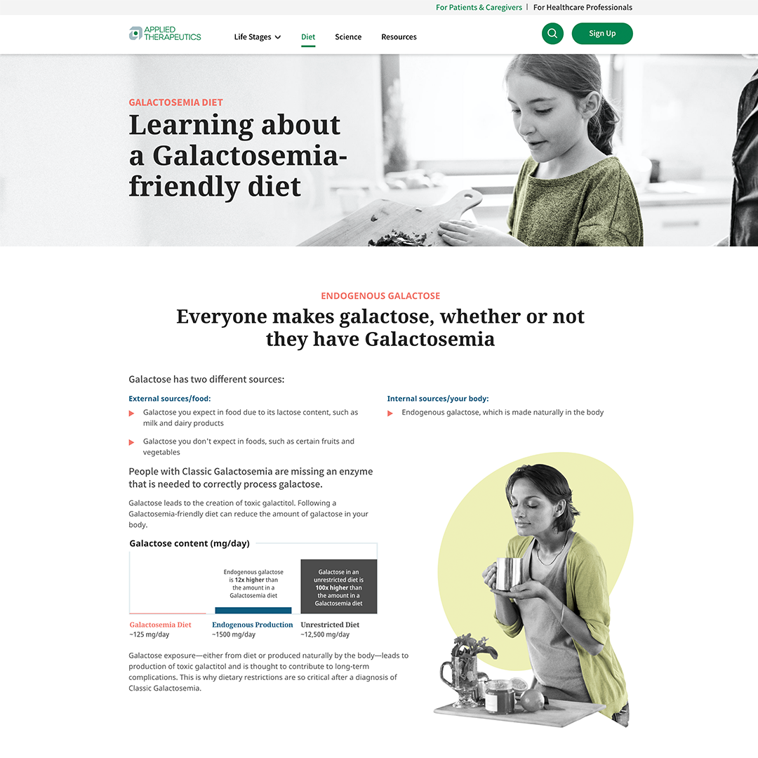
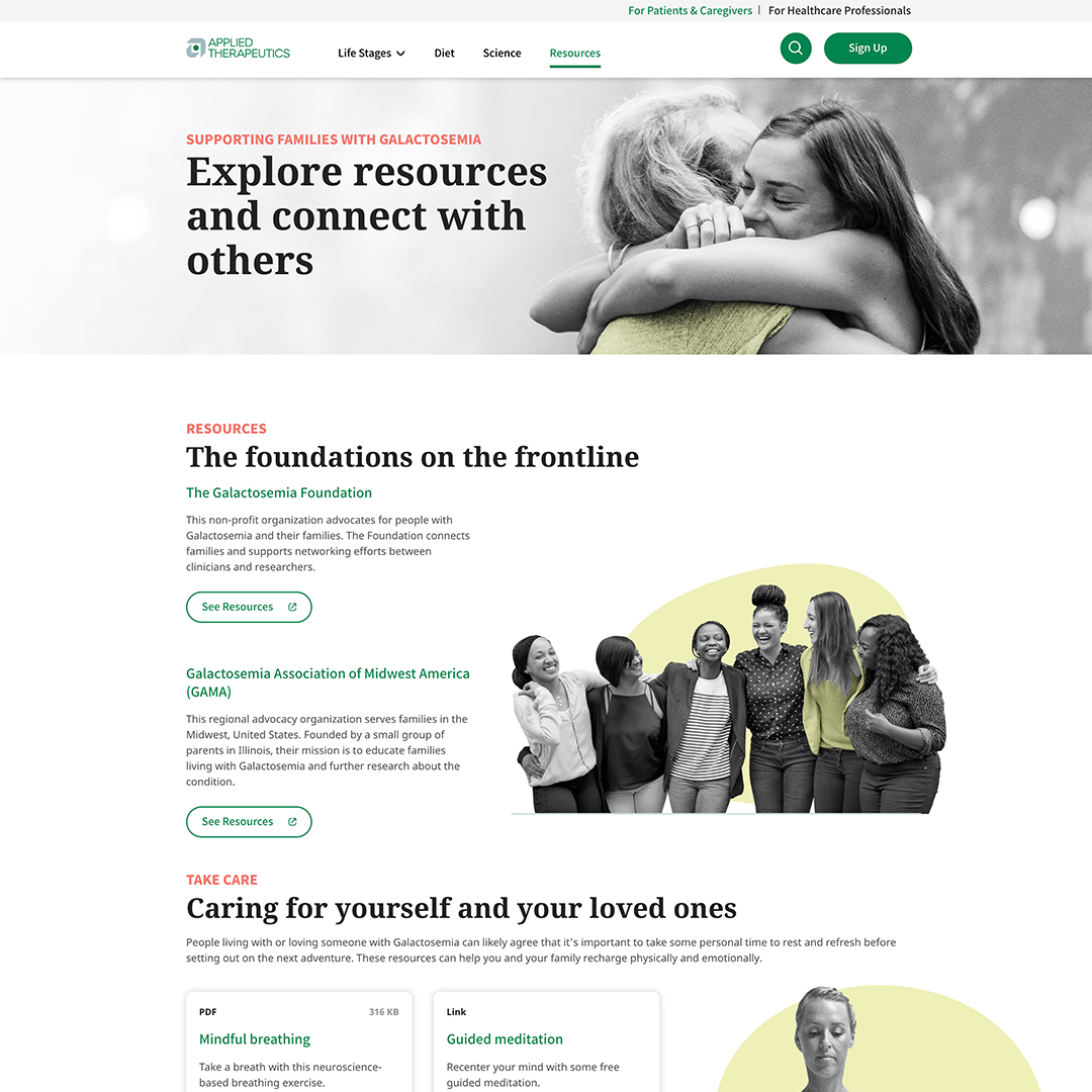
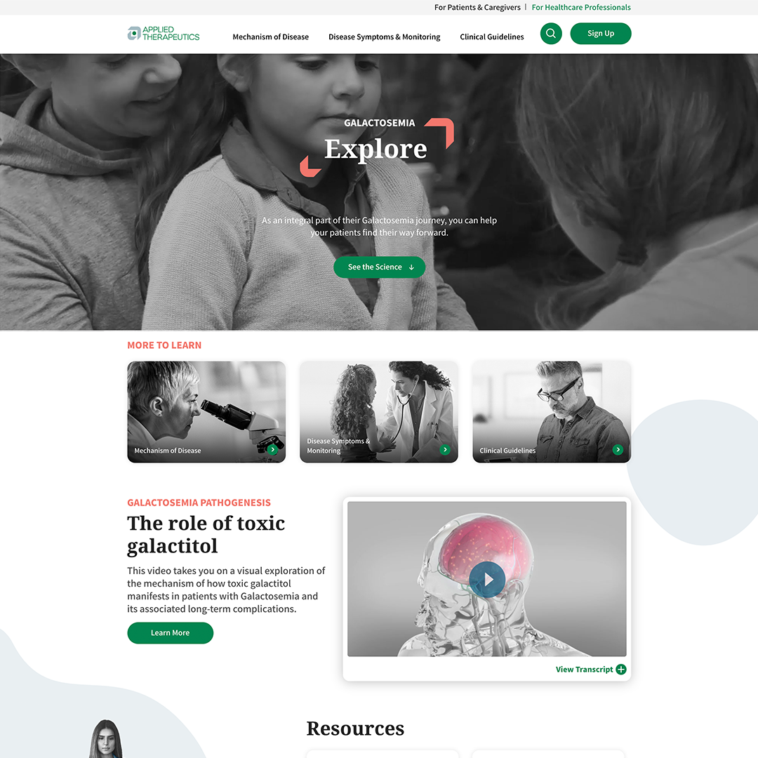
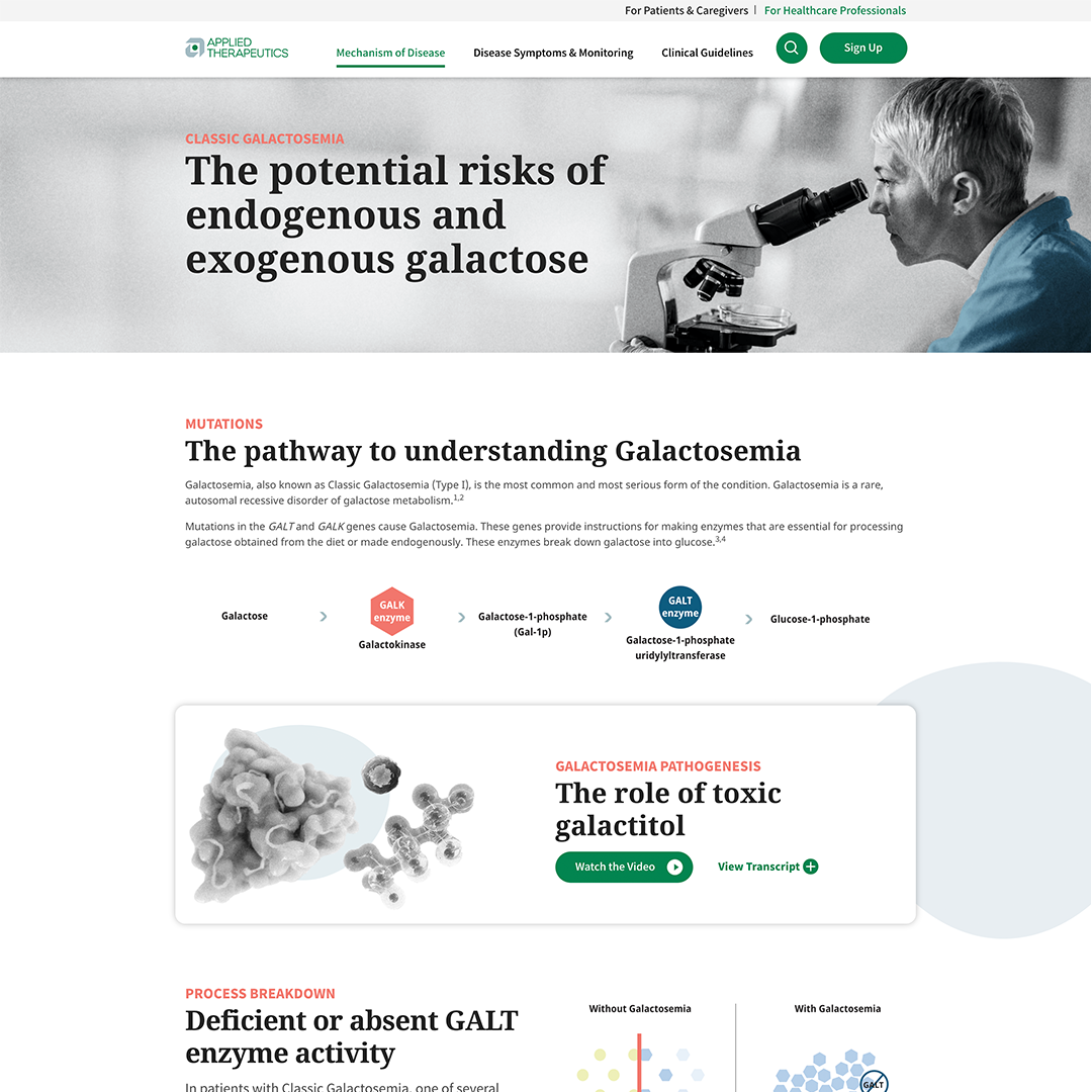
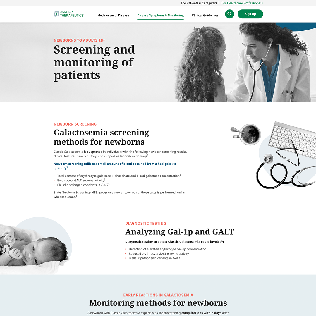
Applied Therapeutics needed an unbranded website creating awareness for a rare disease called Galactosemia. They were looking for an editorial look with lots of interaction and movement on the site. They specifically did not want anything that looked like a “pharma” website.

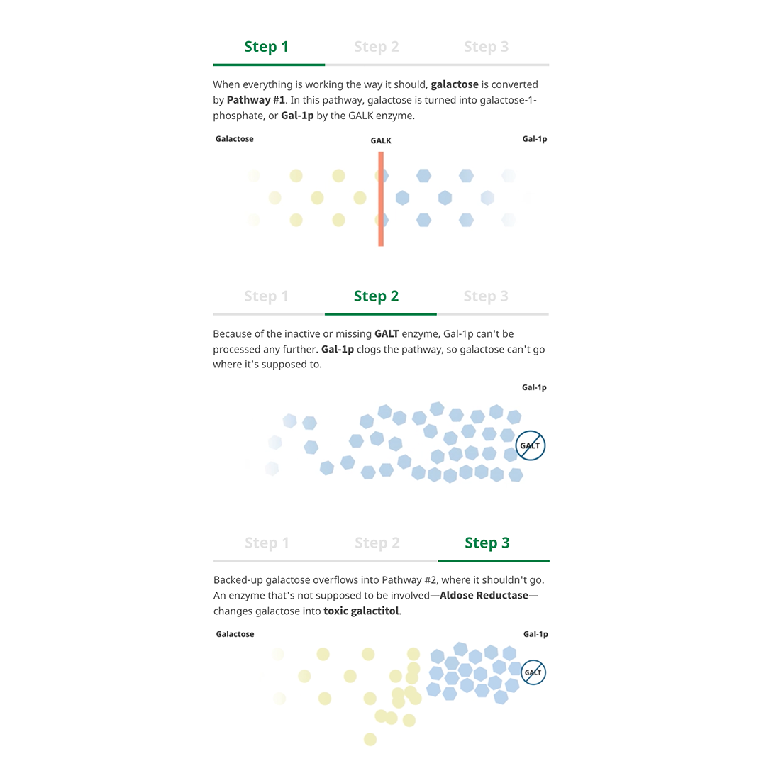
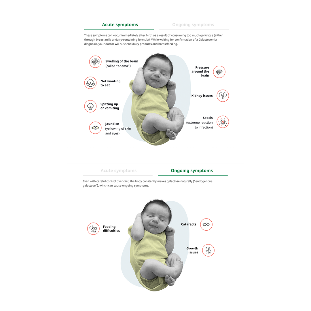
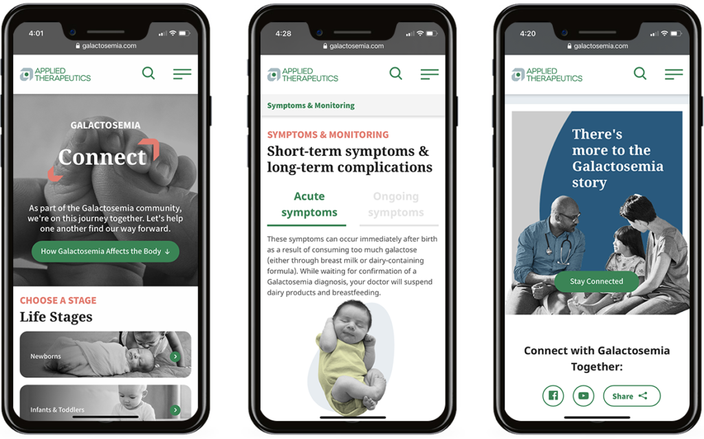
Using black and white imagery and lots of white space, we were able to create that editorial feel. We used yellow to indicate the patient with Galactosemia.

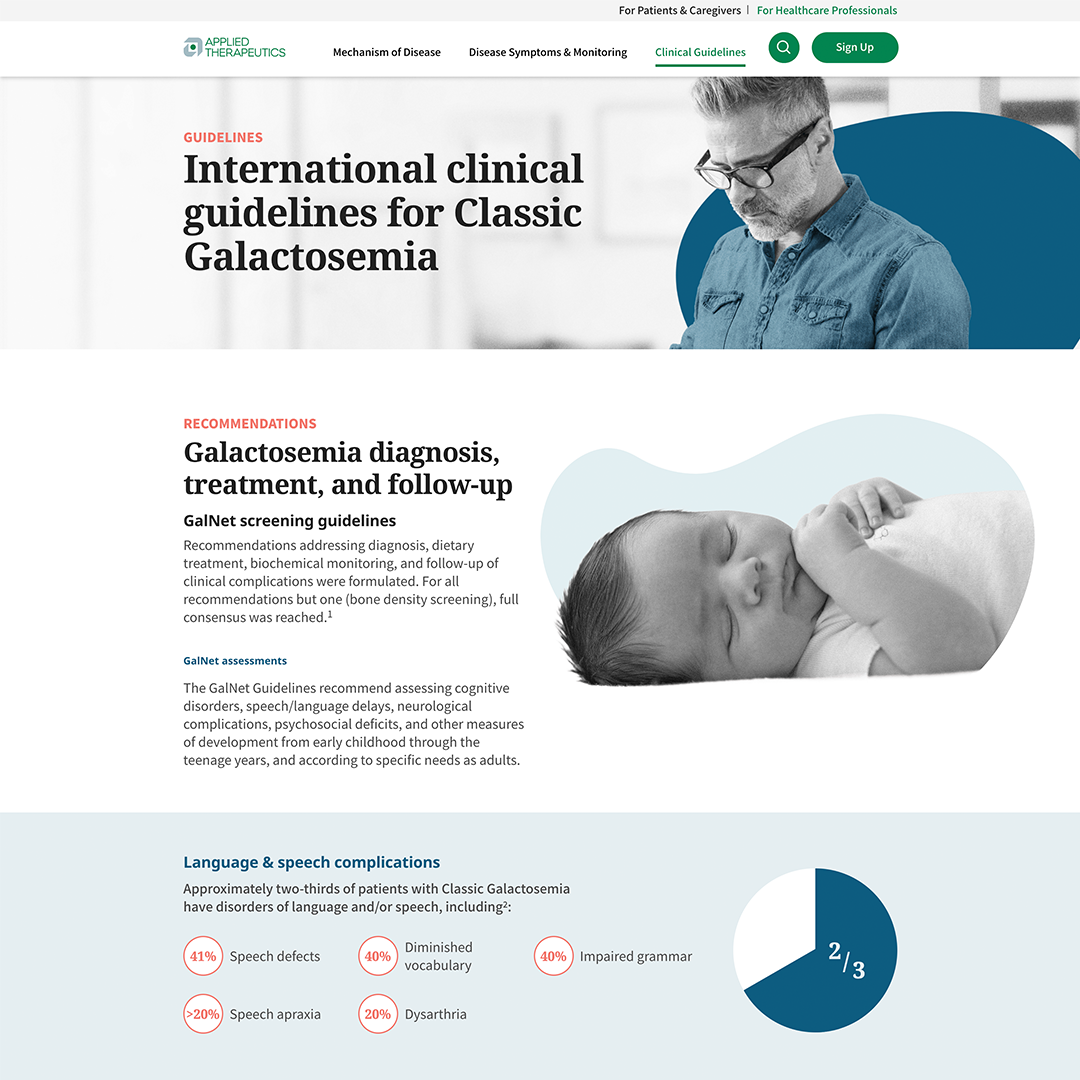
For the HCP pages, we used blue to highlight the HCP, a clear indicator that you are now on the HCP pages.

The client couldn’t say enough about how engaging and visually appealing the site looked and went beyond their expectations.

website

skills

Creative Direction, UI/UX, website design

Desktop pages

Inside page layouts with dynamic content to educate both Patients and HCPs about the rare disease Galactosemia

FEATURES:

Patient life stages

Patient diet tips

Patient science education

Patient Resources

HCP overview

HCP mechanism of disease

HCP disease symptoms & monitoring

HCP clinical guidelines

Interactive components

Many components were designed to convey the information for the user in more digestible interactive experience

FEATURES:

How galactosemia effects the body | Patient

Symptoms

HCP care team

Ingredients explanation

How galactosemia effects the body | HCP


Mobile layouts

Design System

A design system with consistent and recognizable iconography and reusable components for easy navigation.

FEATURES:

Navigation

Button system

Share links

Next button

Callout hover state

Share pop up

Resources components

Emails

Patient Desktop

Galactosemia Email Patient Desktop

Patient Mobile

Galactosemia Email Patient Mobile

HCP Desktop

Galactosemia Email HCP Desktop

HCP Mobile

Galactosemia Email HCP Mobile